Seattle Transit Wayfinding System Criticised for Added Confusion
A new wayfinding system implemented by Sound Transit in Seattle has been met with criticism, with users and commentators finding it more confusing than helpful, despite aims to align with international standards.
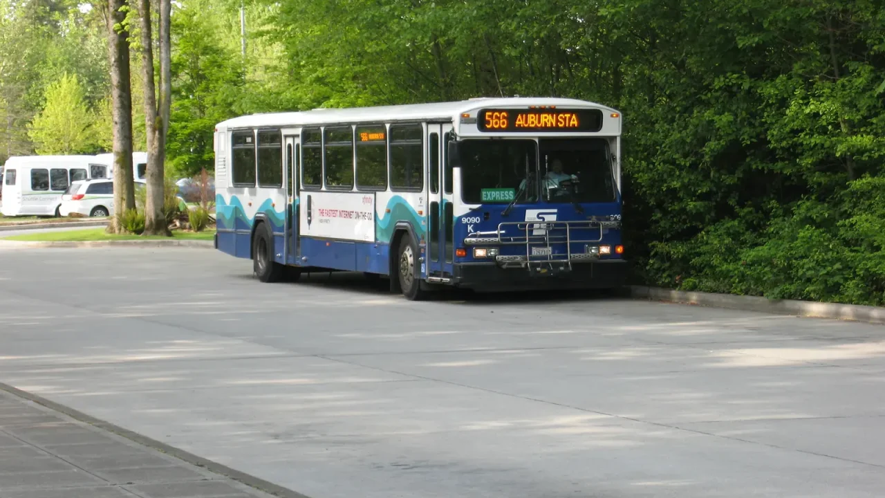
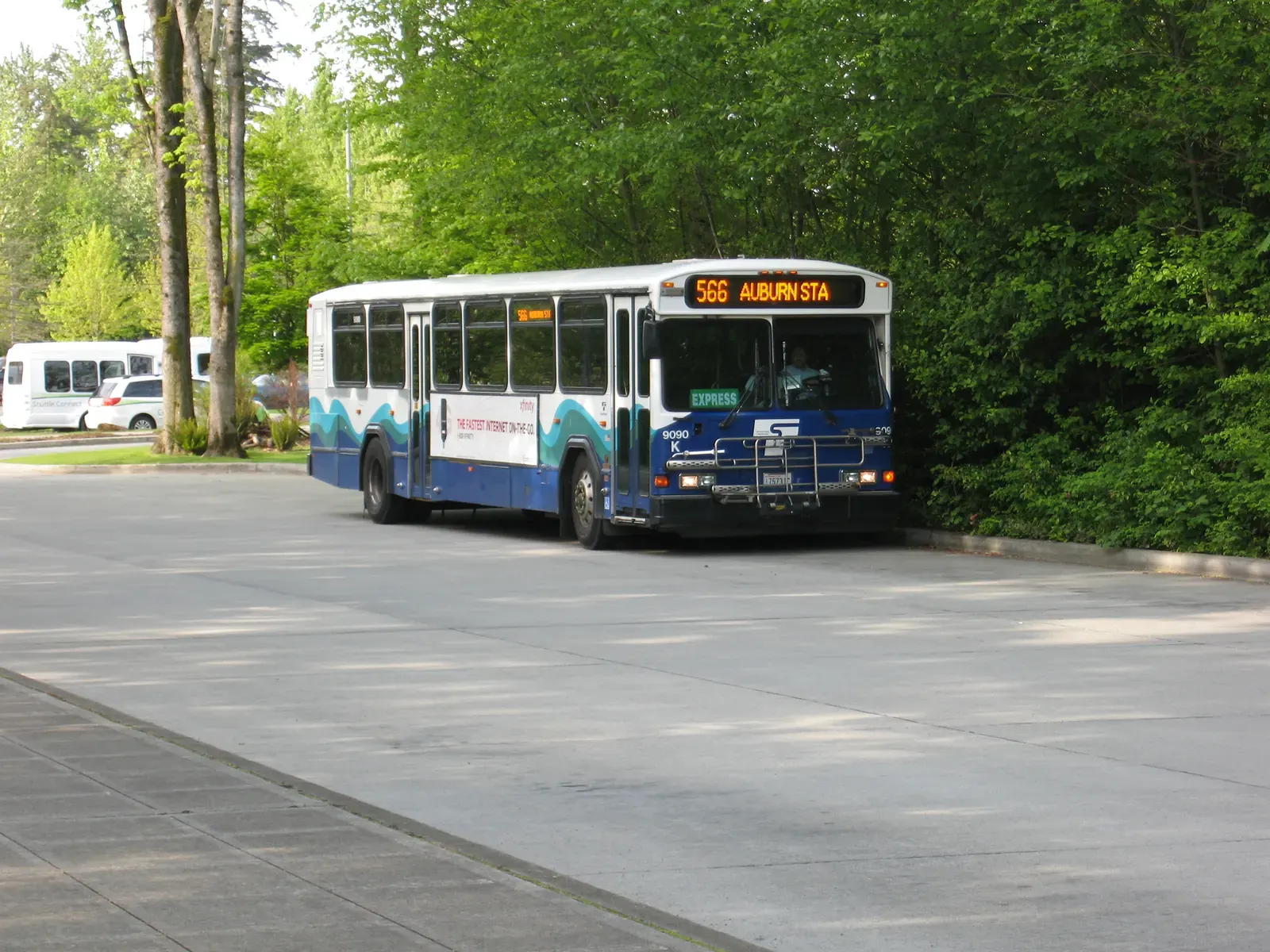
A recent commentary has highlighted significant issues with the new transit wayfinding system introduced by Sound Transit in Seattle, suggesting the changes have inadvertently made navigating the public transport network more difficult for passengers. Despite the agency’s stated intention to align with “international standards” and improve usability, particularly for international visitors attending events like the World Cup, the new signage and information system has drawn criticism for being “more confusing than clarifying.”
Critique of New Signage Features
The commentary, penned by Erica C. Barnett for PubliCola, points to specific elements of the new system that are causing user frustration. Among these are the addition of station numbers to route maps and the removal of location information from station exits. While the intention might have been to streamline information, the practical effect has been an increase in rider confusion.
Barnett notes that existing state law mandates station identifiers that are accessible to individuals with limited English proficiency. Previously, Sound Transit employed a system of pictograms, which, while described as “baffling,” at least offered a visual alternative. These included various animal and boat symbols. However, the new three-digit station numbering system is seen as only a marginal improvement, failing to offer a clear and intuitive method of identification. The potential for confusion is further exacerbated by the duplication of station numbers across different lines, making it easy for passengers to mistake stations on separate routes for the same location.
Directional Information Concerns
A significant point of contention is the method Sound Transit now employs to indicate train direction. Instead of using straightforward directional cues like “north/south” or “east/west,” or referencing common destinations such as “downtown Seattle” or “Airport,” the system uses the terminal station of each line. This means passengers must discern the correct platform based on unfamiliar city names like “Lynnwood City Center” or “Downtown Federal Way,” with no clear geographical context provided. For example, a rider travelling from Beacon Hill towards downtown would need to understand the geographical relationship between Beacon Hill, Lynnwood City Center, and Federal Way to choose the correct platform. This reliance on distant terminal station names, rather than immediate directional or landmark-based information, adds an unnecessary layer of complexity for daily commuters and infrequent travellers alike.
Intent vs. User Experience
The author suggests that the new wayfinding system appears to be the result of well-intentioned decisions made by individuals who may not regularly use the transit system themselves. This disconnect between the planners’ intentions and the actual user experience is a recurring theme in discussions about public infrastructure. Effective wayfinding is crucial for public transport accessibility, encouraging ridership and ensuring a positive passenger experience. When systems become more opaque, they can deter potential users and frustrate existing ones.
The commentary also references the publication date of the original piece, noting it was published on July 6, 2026, by PubliCola, and the Planetizen News article was published on July 10, 2026. This indicates a recent debate surrounding the transit system’s usability.
Key facts
| Feature | Description | Impact |
|---|---|---|
| New Wayfinding System | Sound Transit’s implementation of station numbers and terminal station names for directional guidance. | Increased confusion for passengers, potential accessibility issues for non-native English speakers. |
| Previous System | Pictograms depicting various animals and boats, and directional terms (north/south, etc.). | Described as “baffling” but offered visual cues and clearer directional information. |
| Stated Agency Goal | Alignment with “international standards” and improved usability for international visitors. | Perceived by critics as failing to achieve clarity and potentially hindering usability. |
| Criticism Source | Commentary by Erica C. Barnett in PubliCola. | Highlights specific examples of confusing signage and directional indicators. |
The implications of a confusing transit system extend beyond inconvenience. For a city aiming to promote public transport use, especially in the context of hosting major international events, clear and intuitive wayfinding is paramount. It impacts accessibility for tourists, new residents, and individuals with varying levels of familiarity with the city and its transit network. The critique of Sound Transit’s system raises questions about the process of design and implementation, and whether passenger feedback was adequately incorporated.
Source: Planetizen News, https://www.planetizen.com/news/2026/07/137970-commentary-seattles-new-transit-wayfinding-system-more-confusing-clarifying
Fuente
Planetizen News Publicacion original: 2026-07-10T15:00:00+00:00
Related updates

US mayors rank housing affordability as top crisis as costs squeeze cities
A new survey from the US Conference of Mayors finds affordable housing leading city leaders’ concerns as the rising cost of living…
Read update
Seattle School Board Member Challenges Washington State MAGA-Backed Initiatives
Seattle School Board member Joe Mizrahi has issued a detailed critique of three Washington State ballot initiatives funded by a hedge fund…
Read update
Lessons from Los Angeles: How housing policies can deter new development – a cautionary tale for London
Los Angeles developers are scaling back projects despite huge housing demand, blaming pandemic-era rent protections and a mansion tax that encourages small-scale…
Read update
Uber’s $10B robotaxi bet signals a shift in urban mobility, but London’s streets remain a different arena
Uber has announced a $10 billion investment in autonomous vehicles, intensifying the robotaxi race with Waymo, Zoox and Tesla. For London, the…
Read updateWiki relacionada

Urban Planning Terms: Density, Public Realm and Transit-Oriented Development
A living glossary for terms that appear again and again in planning and development stories.
Read update